When it comes to travel, especially solo travel for women, good information can make all the difference. That’s why I took a closer look at a few infographics that present complex data and safety tips in a way that’s easy to digest—and even empowering. In this post, I analyze two infographics that stand out for their design, clarity, and usefulness to women travelers.

📍 Infographic #1: A Female Guide to Solo Travel
Source: Work the World
This infographic offers practical advice for women who want to explore the world alone, from cultural awareness tips to safety reminders.
Why It’s Effective:
- Visual Hierarchy & Organization: The layout follows a top-to-bottom flow, with clear sections marked by icons. It reads like a checklist, which works well for informational content.
- Color Choices: A calming palette of blues and greens keeps the tone friendly and trustworthy—ideal for advice on safety and preparation.
- Typography & Readability: A clean, sans-serif font is used throughout. Headings are bold and stand out, while body text is concise and well-spaced.
- Text & Visual Balance: Icons and visuals support the text without overpowering it, making the information easy to scan and remember.
- Data Storytelling: The infographic gently guides the viewer through a journey of preparation and empowerment, giving solo female travelers confidence to get started.
What I’d Apply: The checklist format, consistent icon use, and calming color scheme are all elements I’d consider for my own travel infographic.
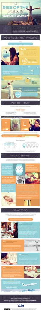
📍 Infographic #2: Everything You Need to Know About Female Travel
Source: Matador Network
This infographic highlights statistics and global trends related to female travel, such as safety concerns, top destinations, and travel motivations.
Why It’s Effective:
- Visual Hierarchy & Organization: The infographic is segmented by topic with bold headers and varied visual formats (pie charts, icons, and maps), making it easy to follow.
- Color Choices: The warm, varied palette draws attention to different data sets while maintaining visual harmony. Each section feels distinct but cohesive.
- Typography & Readability: Text is minimal but powerful, with important stats emphasized using bold fonts or large numbers.
- Text & Visual Balance: The blend of visuals and stats keeps the content engaging and informative without crowding the page.
- Data Storytelling: This infographic does a great job of revealing not just what women are doing when they travel, but why. It presents data in a way that tells a bigger story about growing independence and awareness.
What I’d Apply: I love how this one uses a mix of visuals (like maps and pie charts) to support the narrative. I’d definitely incorporate visualized statistics into my own design to add credibility and clarity.
Final Thoughts
Infographics like these do more than look good—they make important travel information more accessible, especially for women navigating solo adventures. From design choices to storytelling techniques, these visuals demonstrate how to communicate clearly and creatively.
As I move forward with my own infographic project, I’ll take inspiration from their use of color, clarity, and structure to build something that’s not just informative, but also empowering.

Leave a comment